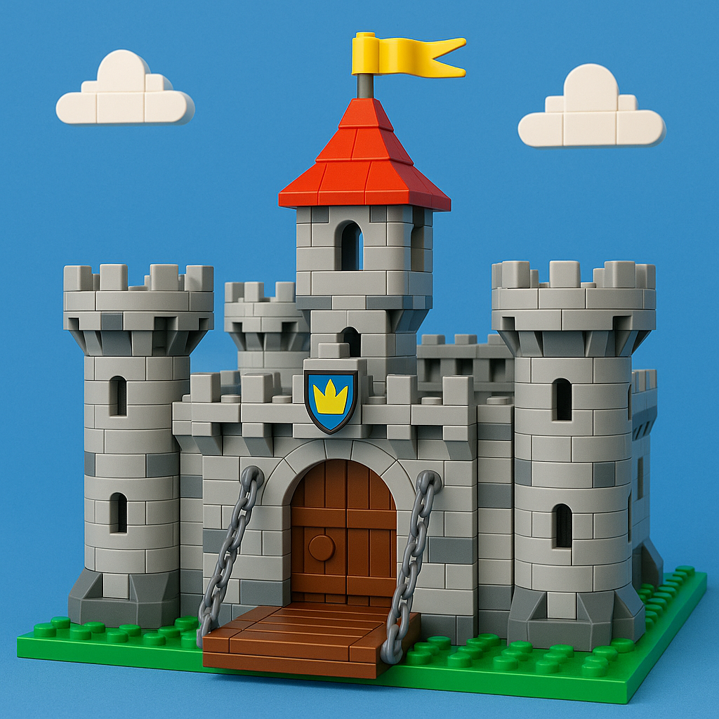
When most people picture a medieval castle, they envision imposing grey stone walls rising against a cloudy sky—monolithic, austere, and colorless. But here’s the surprising truth: medieval buildings were actually vibrant with color, pattern, and visual interest. Archaeological evidence reveals that castles featured painted plaster, decorative stonework, colorful banners, and intricate heraldic displays.
For adult LEGO builders creating historically informed castle MOCs, understanding authentic medieval color palettes transforms your builds from generic fantasy fortresses into architecturally credible recreations. This guide explores period-appropriate color schemes, practical techniques for realistic stone effects, and the traditions of medieval heraldic colors. Let’s challenge those grey castle assumptions and bring medieval architecture to life, one brick at a time.
The Reality of Medieval Architecture Colors
Medieval Color Myths vs. Reality
The popular image of drab grey castles is largely a modern invention. Centuries of weathering stripped away original finishes, and romantic 19th-century paintings emphasized the rugged, timeless quality of ancient stone. Medieval builders actually used color extensively and deliberately.
Archaeological investigations have revealed:
- Whitewash and colored plaster on exterior surfaces
- Painted timber and decorative frescoes
- Bold patterns of red and white on cathedral exteriors
- Brilliant white lime wash visible for miles (both weather protection and status symbol)
Consider the half-timbered buildings throughout England and France, where dark wooden beams contrasted dramatically with white or cream plaster. Even fortress walls were frequently covered with protective lime wash rather than left as bare stone.
Regional variations were significant:
- Mediterranean castles used warm limestone and sandstone, often with ochre-tinted plaster
- Northern European fortifications relied on grey granite and darker stone, with painted interiors and colorful textiles
- Eastern European strongholds pioneered distinctive red brick construction
Primary Building Materials & Their Colors
Medieval masons worked with whatever local stone was available, creating regional color variation:
Common Stone Types:
- Limestone: Creamy white to light grey to warm beige (most common)
- Sandstone: Red, pink, and tan hues (Heidelberg’s famous red sandstone castle)
- Granite: Darker greys to black (Scottish and Welsh castles)
- Brick: Northern Germany and Low Countries where stone was scarce
Timber and Other Materials:
- Oak beams: Darkened to deep brown or black over time
- Wattle and daub panels: Plaster painted white or cream
- Thatch roofing: Warm golden-brown (lesser buildings)
- Slate: Grey, green, or purple-grey (high-status structures)
- Clay tiles: Red-orange (Mediterranean and churches)
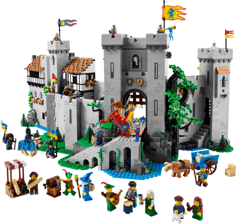
Period-Appropriate Color Schemes for LEGO
Stone and Masonry Colors
The modern LEGO “Bley” (bluish grey) palette actually offers excellent options for realistic stone representation.
Your Essential Stone Colors:
Light Bluish Gray – Your primary workhorse
- Limestone and weathered granite
- Excellent part availability
- Best single-color choice for castle building
Dark Bluish Gray – Depth and weathering
- Darker stone types and shadow areas
- North-facing walls and moisture damage
- Use at 70% Light/30% Dark ratio for realistic variation
Tan and Dark Tan – Warm stone alternatives
- Perfect for sandstone and Mediterranean builds
- Works for southern French châteaux and German fortifications
- Can mix sparingly with greys for multi-stone structures
Reddish Brown and Dark Orange – Specialized uses
- Brick construction (northern European contexts)
- Terracotta details and weathered red sandstone
- Dark Orange captures aged brick beautifully (but limited parts)
Timber and Wood Elements
Medieval timber was almost never left natural—it darkened through age or protective treatments.
Simple Color Choices:
- Dark Brown: Aged oak beams (your standard)
- Reddish Brown: Newer construction or better-maintained wood
- Black: Tar-treated timbers or charred beams
Choose Dark Brown for most applications—it offers the best versatility and part availability. Black works beautifully for northern European half-timbering where dramatic contrast was desired.
Plaster and Painted Surfaces
Here’s where historical accuracy meets LEGO practicality.
The White Problem: Pure white LEGO can appear stark and unrealistic. Historical lime wash weathered to off-white quickly, so pure white represents very fresh surfaces only.
Better Alternatives:
- Light Tan: Aged plaster and weathered whitewash (most versatile)
- Tan: Heavily aged or ochre-tinted plaster (southern European)
- White: Use sparingly for specific fresh details
Color Rule: Stick to neutral earth tones for structural surfaces. Bright blues, reds, and greens were expensive pigments reserved for heraldic displays and special decorative programs, not general walls.
Stone and Mortar Color Techniques
Creating Realistic Stone Texture
The secret to convincing LEGO stonework? Controlled variation, not perfect uniformity.
The 60/25/15 Distribution Rule:
- 60% Primary color: Visual coherence (typically Light Bluish Gray)
- 25% Secondary color: Distributed irregularly (Dark Bluish Gray or Tan)
- 15% Accent stones: Scattered variation suggesting repairs and different quarries
Placement Tips:
- Place darker stones in organic clusters of 3-4 together
- Avoid regular patterns like checkerboards (too artificial)
- Study photos of real medieval walls for natural distribution
- Put accent colors near corners, around windows, scattered randomly
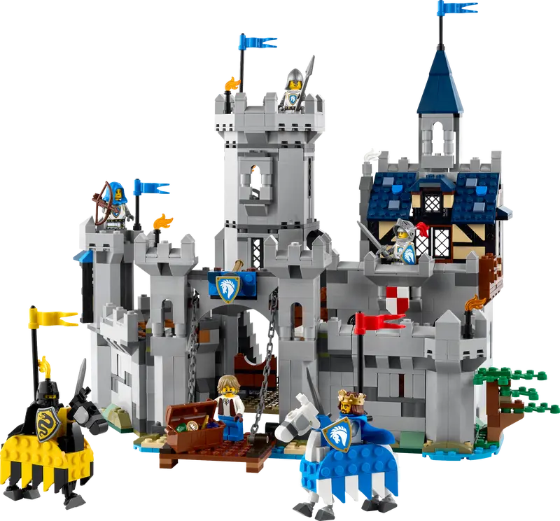
Weathering Effects
Medieval stone weathered predictably:
Ground Level (Bottom 2-3 courses):
- Use Dark Bluish Gray for moisture damage
- Rising damp and rain splash-back darkened these stones
Upper Portions:
- More Light Bluish Gray or occasional Tan pieces
- Sunlight bleached the tops of towers and walls
Corner Stones (Quoins):
- Often cut from better stone
- Consider making them slightly lighter or contrasting
- Window and door surrounds received similar premium treatment
Mortar Lines
Medieval lime mortar was typically lighter than the stone it bonded.
LEGO Mortar Technique:
- Use thin plates in a color one shade lighter than primary stone
- Light Bluish Gray plates between Tan bricks, or vice versa
- Represent mortar only at major course lines (every 3-4 brick heights)
- SNOT technique: Turn bricks sideways for thin horizontal mortar lines
Key Rule: Less is more. Overly visible mortar looks like modern blockwork rather than medieval masonry.
Heraldic Color Traditions in LEGO
Historical Heraldry Basics
Medieval heraldry developed as practical identification for armored warriors, then evolved into a sophisticated visual language.
The Seven Traditional Tinctures:
Metals:
- Or (gold)
- Argent (silver)
Colors:
- Gules (red)
- Azure (blue)
- Sable (black)
- Vert (green)
- Purpure (purple)
The Golden Rule: Metal should not be placed on metal, nor color on color. This ensures visual contrast and readability—crucial for identifying allies at distance.
Color Meanings:
- Purple and gold = royalty (expensive pigments)
- Simple red-and-white = respectable but lesser means
- Bright crimson = significant wealth (costly dyes)
LEGO Heraldic Applications
Translating Tinctures to LEGO:
For Banners and Flags:
- Gules (red): Bright Red (modern) or Dark Red (aged)
- Azure (blue): Blue or Dark Blue
- Sable (black): Black
- Vert (green): Dark Green (green appeared less in heraldry)
- Purpure (purple): Dark Purple (expensive, like historical purple)
- Or (gold): Yellow (reads as gold) or Pearl Gold (stunning but costly)
- Argent (silver): White or Light Bluish Gray
Design Tips:
- Keep banner patterns simple at LEGO scale
- Divided fields, central crosses, or single charges work best
- Complex quartered designs become muddy and unreadable
- Follow the rule of tincture for authentic appearance
Beyond Banners:
- Painted shields on castle walls
- Floor patterns in great halls (red and white checkerboards)
- Window tracery in heraldic colors
- Gatehouse decorative panels with shield patterns
⚔️ Heraldic Colors 101 ⚔️
Your Essential Guide to Medieval Color Traditions in LEGO Building
What is Heraldry?
Medieval heraldry was a visual identification system for knights in armor. It evolved into a sophisticated language of color, pattern, and symbolism that governed everything from battle flags to castle decorations. Understanding these traditions helps you create historically authentic LEGO castle builds.
The Seven Traditional Tinctures
⭐ Metals (High Status)
Yellow works great; Pearl Gold is stunning but expensive (just like real gold!)
White reads as silver in heraldic contexts; Light Bluish Gray suggests aged silver
🎨 Colors
Most common heraldic color; bright for modern banners, dark for aged/weathered
ColorRoyal color; excellent part availability in LEGO
ColorProvides strong contrast; very common in medieval heraldry
ColorLess common in heraldry than red or blue
ColorRare and expensive (historically AND in LEGO!); reserved for royalty
ColorThe Rule of Tincture
The Golden Rule: Metal should not be placed on metal, and color should not be placed on color. This ensures maximum contrast and readability—crucial when identifying friend from foe at a distance on the medieval battlefield.
💡 LEGO Building Tips
- Keep designs simple: Complex patterns become muddy at LEGO minifigure scale
- Divided fields work best: Half one color, half another reads clearly
- Use bold charges: A single cross, chevron, or stripe is more effective than intricate details
- Yellow = Gold: Don’t feel pressured to buy expensive Pearl Gold; regular Yellow works perfectly for heraldic gold
- Test your designs: View your banners from 3-4 feet away—if you can’t clearly see the pattern, simplify it
- Historical inspiration: Look up real medieval coats of arms for authentic design ideas
Ready to add authentic heraldry to your castle builds?
Follow the rule of tincture, keep it simple, and your medieval MOCs will look historically credible!
Balancing Accuracy with LEGO Constraints
Finding Your Sweet Spot
Historical accuracy exists on a spectrum. Consider your build’s purpose:
Display Pieces:
- Justify extra effort sourcing specific colors
- Can use rare or expensive parts
- Advanced color mixing and weathering techniques
Playable Builds:
- Prioritize structural integrity
- Stick to common, durable pieces
- Simplified color schemes (2-3 main colors)
The Compromise Approach: Choose one historical principle to honor faithfully while remaining flexible on others. Maybe you commit to realistic stone variation but simplify heraldic designs. Or insist on period-accurate heraldry while accepting practical window designs.
Part Availability Challenges
When facing limited parts:
- Check BrickLink for aftermarket availability
- Explore alternative colors with similar effects
- Limit rare colors to small but visible areas
- Buy in bulk when you find good sellers
Smart Shopping:
- Create wanted lists for multiple items from single sellers
- Buy 500 pieces at once for better per-piece pricing
- Factor color rarity into initial design decisions
- Pearl Gold accents communicate luxury without using it everywhere
Regional Medieval Color Variations
Northern European Castles
English, Scottish, and Scandinavian castles used cool grey tones.
LEGO Palette:
- Primary: Light Bluish Gray (dominant)
- Secondary: Dark Bluish Gray for weathering
- Accent: Dark Brown timber elements
- Minimal warm tones maintain austere character
Scottish castles using dark granite can incorporate more Dark Bluish Gray for distinctly darker presence.
Mediterranean Fortifications
Southern France, Spain, and Italy featured warm, sun-drenched colors.
LEGO Palette:
- Primary: Tan and Dark Tan (emphasize warmth)
- Secondary: Light Bluish Gray with warm mixing
- Roofing: Reddish Brown slopes (clay tiles were universal)
- Generous use of Tan and White for rendered walls
Key Difference: Mediterranean walls were often plastered and painted, not exposed stone. Use more plaster colors, not just accent elements.
Eastern European Examples
Red brick fortifications created distinctive color schemes.
LEGO Palette:
- Primary: Reddish Brown or Dark Red (extensive use)
- Secondary: Dark Bluish Gray for stone foundations
- Contrast: Stone corners framing brick infill
- Dramatic visual results reflecting historical practice
The Teutonic Knights’ castle at Malbork exemplifies this with massive red brick walls—entirely brick, not just brick accents.
Practical Building Example
Castle Wall Section Breakdown
8-stud-high wall (representing ~6 feet):
- Foundation course: All Dark Bluish Gray (ground weathering)
- Second course: 75% Light Bluish Gray, 25% Dark Bluish Gray (transition)
- Courses 3-6: Your 60/25/15 distribution with scattered Tan accent pieces
- Seventh course: Thin Tan plate for mortar line
- Top course: Nearly all Light Bluish Gray (sun-bleached crenellations)
Result: Realistic weathering gradient from dark base to light top.
Conclusion
Medieval architecture was never monotone grey stone. From warm Mediterranean limestone to stark northern timber framing, from vibrant heraldic banners to subtle stone weathering, medieval buildings displayed remarkable color sophistication.
Your Keys to Success:
- Understand regional stone colors and weathering patterns
- Use the 60/25/15 color distribution for realistic stone
- Apply heraldic traditions to banners and decorative elements
- Balance authenticity with practical LEGO constraints
- Study real medieval buildings for natural color placement
Whether you’re building a specific historical castle or creating an inspired design, these color principles elevate your work beyond generic grey fortresses. Start with a historically appropriate palette for your region, add realistic weathering through controlled variation, incorporate period-accurate heraldic elements, and find your balance between accuracy and practicality.
What inspires your next build? Scottish granite tower houses? French sandstone châteaux? Eastern European brick fortresses? Share your medieval building projects and color choices in the comments!