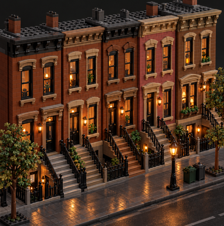
Walk down any real high street and you will notice something odd. The flats above the shops are usually forgettable, yet the ground floor is where all the personality lives. Glass, signage, awnings and a door that practically invites you in.
Most Lego cities get this backwards. The houses get the love, and the shops end up as a brick box with a sticker on the front.
This guide treats the shopfront as the design problem it really is. We will look at glazing, fascias, awnings and door sizing at minifig scale, then work out what each kind of shop needs behind the glass. If you have already built the residential side of your city, this is the next layer up in realism.
This post may contain affiliate links. As an Amazon Associate I earn from qualifying purchases.
🪟 Shopfront Anatomy at Minifig Scale
A good shopfront has four jobs: show the goods, welcome the customer, announce the name and keep the weather off. Each one maps to a part of the facade, and getting the proportions right matters more than any single clever technique.
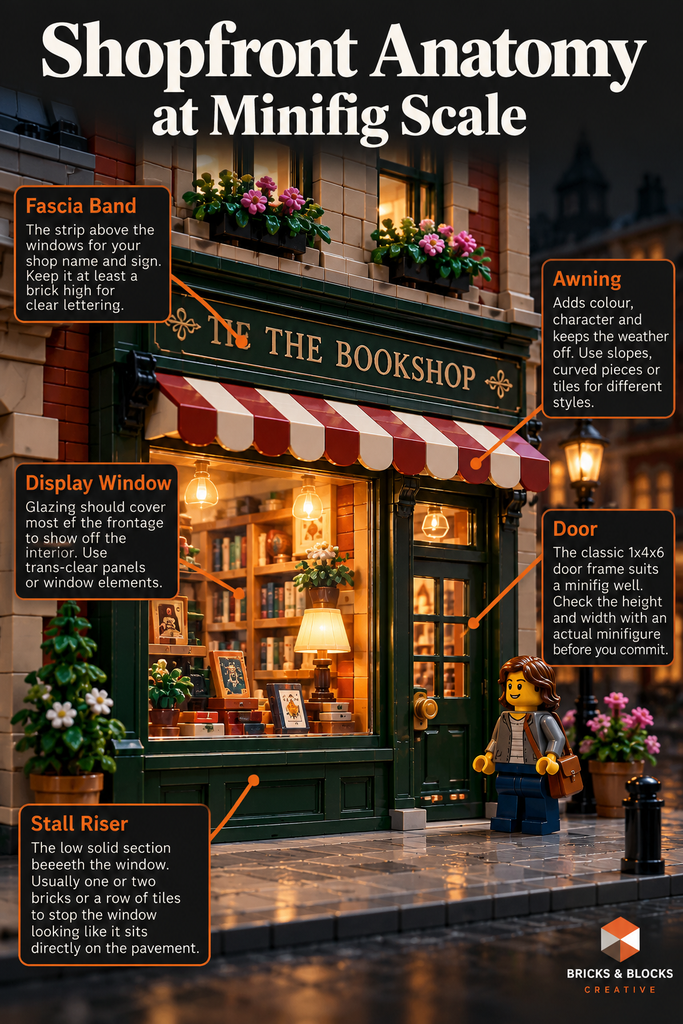
Start with the display window. Real shop windows are big, often taking up most of the ground floor width. In Lego, aim for glazing that fills well over half the frontage, framed by narrow piers rather than thick walls.
The stall riser is the low solid section beneath the window. On real streets it is typically a short band of brick, stone or painted panel. In Lego it is usually one or two bricks or a row of tiles, and it stops the window from looking like it is sitting on the pavement.
The door sets the scale for everything else. The classic Lego door frame is a 1x4x6 element, which suits a minifig comfortably. Put a minifigure next to your door before you commit, because a door that is too short or too wide is the quickest way to make a building feel like a model.
Here is a quick checklist for a convincing ground floor:
- Glazing covering most of the frontage
- A visible stall riser below the window
- A door sized against an actual minifig, not guessed
- A clear fascia band above the glass for the sign
- An awning or canopy where the shop type suits one
Choosing your glazing
You have two broad routes. Trans-clear panes and windscreens give you a genuine glass look and let people see inside, which is ideal when you have built an interior worth showing off.
Framed window elements are sturdier and easier to build into a wall. They suit smaller or older-style shops, where the glazing is divided into smaller panes.
Mix both if you like. A big trans-clear display window on a modern boutique next to a small-paned bakery window gives a street its variety.
Awnings and canopies
Awnings do more than decorate. They break up a flat facade, add colour and give a visual cue that this is a shop rather than a house.
Slope pieces, curved slopes and tiles on hinges or clips can all make a convincing awning. Stripes work well, but keep the colours consistent with the rest of the street so one shop does not shout over its neighbours.
Check the clearance too. If a minifig cannot walk under the awning without a hat collision, raise it by a plate or two.
🔤 Signage and Lettering That Reads From the Street
A shop without a readable sign is just a room with windows. The fascia band is the strip of wall above the shopfront, and it is where the name lives.
Make it deep enough to carry lettering. A band that is one plate tall will look cramped, while one that is a full brick or more gives you room to breathe.
You have three main options for the lettering itself:
- Tile lettering: Individual printed or placed tiles spelling out a name. Flexible, but fiddly and expensive if the name is long.
- Printed or sticker signs: Quick and crisp, and a good option for a single standout shop.
- Built lettering: Letters made from plates, tiles and clips. Time consuming, but unique and very satisfying.
Whichever route you take, keep the name short. A three-to-six letter name reads at a glance and is far easier to build neatly than a long one.
Keep signs readable at street level
Contrast does the heavy lifting. Light lettering on a dark fascia, or the other way round, will always beat two similar mid-tones.
Think about the whole street too. If every fascia is a different bold colour, nothing stands out. Let a few shops go quiet so the loud ones have room to be seen.
If you are planning colour across a whole city, our Lego colour guide for adult builders is a good place to settle a palette before you start buying parts.
🏪 Shop Types and What Each One Needs
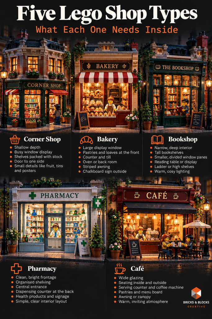
Different shops have different bones. Thinking about what happens behind the counter helps you decide on depth, window size and detail before you start building.
The corner shop
A corner shop wants a tight, busy frontage. Think shallow depth, a window plastered with display pieces, and a door tucked to one side.
Stock goes right to the glass. Use small round plates, 1×1 tiles and studs-up pieces to suggest tins, boxes and produce stacked behind it.
The bakery
Bakeries are all about the window. Put the best display right at the front, using tan, reddish-brown and white to suggest loaves, pastries and cakes.
Behind it you need a counter and, ideally, a hint of an oven or back room. A striped awning is almost traditional here, and a small chalkboard sign near the door adds a lovely touch.
The bookshop
Bookshops are deep and narrow, with shelves running along the walls. The window can be smaller and more traditional, often with divided panes, because the real show is inside.
Use plenty of 1×2 and 1×1 elements in mixed colours to build the shelves. Dark wood tones on the fascia suit the character well.
The pharmacy
Pharmacies tend to be clean, bright and slightly more modern. Large uncluttered windows, a neat sign band and a clear central door give the right feel.
Inside, wall shelving and a raised dispensing counter at the back set it apart from other shops. Keep the colour palette restrained, with a single accent colour for the sign.
The café
Cafés are the most social shop type, so they suit open frontages and generous glazing. Think foldable doors or wide openings, a couple of outdoor tables and chairs, and an awning that shelters them.
Leave room inside for a counter, a few tables and maybe a small kitchen area. A café is also the best candidate for a removable floor, because the interior is half the charm.
🛋️ Minifig-Scale Interiors
You do not need a full interior in every shop. But one or two shops with properly furnished insides will transform how your street feels, especially when lit.
Focus on the essentials: a counter, shelving or display units, and a few stock displays. Keep the layout clear enough that a minifig can stand behind the counter and still reach the till.
Make it accessible
Interiors are no fun if you can never see them. Design the shop with a removable floor or roof section so you can reach inside for rearranging, cleaning or photographing.
Plan the access before you build the walls. Clip hinges and Technic pins make good, tool-free connections for a lift-off section.
Lighting the interior
A lit shop window at dusk is one of the most atmospheric things you can add to a Lego city. If you fancy it, our guide to LED integration in a Lego city covers the practical side, so we will not repeat it here.
Just remember that shop interiors need light in the right place. Aim for illuminating the counter and display areas, not flooding the whole room.
🏢 Mixed-Use Stacking: Shops Under Flats
Real high streets rarely have a shop on its own. Most have flats or offices above, which gives you a chance to build a more convincing city block.
The challenge is structural. A wide shop window means a wide opening, and wide openings can make the floors above sag or flex.
Spanning wide openings
Use a beam or lintel across the top of the shopfront. Long plates, Technic beams or a row of overlapping bricks can carry the load above the glass.
Overlap your bricks across the join, so there is no continuous vertical seam running up through the window openings. Test the build by gently pressing on the upper floor before you add more weight.
If you need help planning the flats above, our multi-storey Lego apartment building guide covers stacking and floor structure in more detail. For terraced streets, see row houses and brownstones.
Matching ground floor to upper floors
The shopfront should look different from the floors above, but not alien to them. Echo a colour, a brick bond or a window rhythm so the building reads as a single design.
A contrast in materials works well. A painted or glazed ground floor under a brick upper storey is a very common and very believable look.
🏙️ Placing Shops in the City
Shops need customers, and customers need footfall. Placing your retail in the right spots makes the whole city feel alive.
Cluster shops along a high street rather than scattering them evenly. Real retail bunches up, and a continuous run of shopfronts creates that busy, browsable feel.
Corner plots are prime real estate. A shop on a corner can have windows on two sides and a chamfered or recessed door, which adds a lot of visual interest for very little effort.
Mix the types, too. A bakery next to a bookshop next to a café looks natural, while ten identical shops in a row looks like a repeating pattern.
Think about the street itself
A shopfront only works if there is somewhere for people to walk. Leave enough pavement for minifigs to browse, and consider room for a bench, a bin or a planter outside.
Our guide to designing realistic Lego city streets covers widths and traffic flow. If you are still laying out the bigger picture, the Lego city master plan guide helps you decide where a retail district belongs.
✅ Bringing It Together
A great Lego shop comes from a handful of decisions made early. Get the glazing ratio right, give the sign a proper home, size the door against a real minifig, and think about what the shop does inside.
Start small. Build one shopfront, put it on your street and see how it changes the rest. Chances are the houses on either side will suddenly look like they need an upgrade.
Which shop type will you build first? A café with a removable floor, or a bakery with the perfect window display?